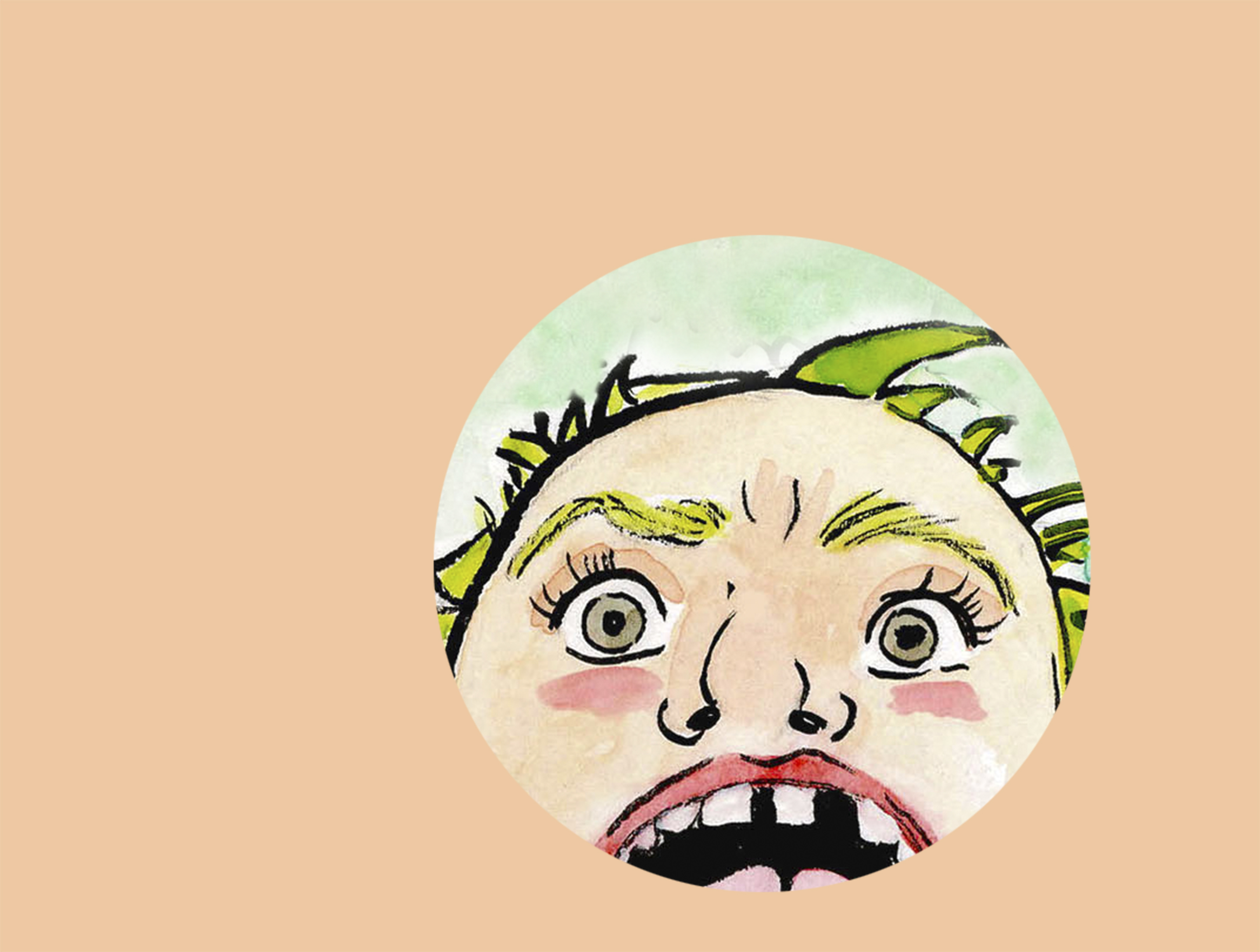
Above: A panel from Darin Shuler’s Castle & Wood #7, which will premiere at this year’s Short Run
Tomorrow, Nov. 30, is
the third annual Short Run, a magical gathering of the Northwest’s zine publishers, underground comic artists and animators. From 11 a.m. to 6 p.m., Washington Hall will transform into an all ages techincolor dreamland of doodles and squiggles, culminating in a 21+
“Comics Prom”
at 7:30 p.m. featuring local bands Pony Time, The Shivas and Specs Wizard. In anticipation of Short Run, I talked to local illustrator Darin Shuler, the man behind this year’s official Short Run poster and the creator of
Castle & Wood comics
.
When I called Darin Shuler, he had just folded and stapled the first copy of issue #7 of his incredible comics series, Castle & Wood.
“I’m going to tell you something really embarassing right now,” he said. “I’d always just creased each page with a crayola marker and nested it in the next page one by one. My buddy came over today and put all the pages in a stack and folded them all at once. It blew my mind. I felt like such a dipshit, I’ve never done that before.”
Shuler’s Castle & Wood series is a mind-melting adult adventure comic starring its eponymous heroes, a battle-ready mouse and his cat companion (whose body type has shifted throughout the series from that of a feline, to a human, to a giant cat beast thanks to interdimensional warps and mad scientists).
Shuler’s been crafting the comics for over a year now thanks to a 2012 Xeric Foundation grant, a non-profit established by Peter A. Laird, the creator of Teenage Mutant Ninja Turtles.
“I always joke I got some of my money back with the grant because I put a lot of my money into the Ninja Turtles franchise,” Shuler says. “Me and my brother still have a drawer full of the action figures, they stayed in the family like heirlooms or something, toys like the Technodrome.”
Shuler’s work is incredibly dense visually and narratively. Part of the joy in reading Castle & Wood is getting stuck on particularly arresting panels, taking the time to feast on the tiny intricate patterns and hidden details that fill up every corner of the page.
In issue #4, Castle & Wood find themselves in a dystopic metropolis ruled by a sort of robot-hologram overlord. Shuler translates the clutter of the city onto the page by creating overwhelmingly layered landscapes, with as much attention being paid to the piss stains on the sidewalk as are given to the main characters. The towering skyscrapers, futuristic warp taxis, and garbage littered streets make the grungy city a character of its own.
Above: Issue #4 of Castle & Wood is a prime example of Shuler’s dense visual style
The storylines are often just as pleasantly cluttered as the artwork. In issue #2, the heroes are transported to another dimension where things get very meta. The characters stumble upon a massive comics wall that storyboards their past and future, allowing them to glimpse into their destiny. The question of whether or not to look ahead plunges them into an ethical quandry and initiates philosophical debates about the concept of fate.
The plot device was inspired by one of Shuler’s favorite movies, the 1984 children’s fantasy classic The Neverending Story.
“There’s this scene where Atreyu (the protagonist) sees pictures of all the places he’s been on these murals he finds on the wall,” Shuler says. “The last one he sees is that black panther thing. Right when he sees that, he turns and sees it in a cave and it jumps out at him. I thought that was so cool, that those murals are just showing up in front of him.”
Shuler has considered getting the Auryn amulet from the movie tattooed on himself a number of times as a symbolic gesture of the debt he owes the film, which he says he’s watched countless times.
Above: The scene that inspired Shuler’s metaphysical second issue.
“In a way the Neverending Story is a lot like a Castle & Wood comic,” Shuler says. “There are so many ideas in that movie that you don’t really have time to tackle them all as a kid on one viewing. In Castle & Wood #2, there are so many things in that comic book that I could’ve done entire separate issues on. It speeds over these things and it’s like ‘What the fuck?’ It’s crazy, but I kind of like that.”
Part of the density of the storyline is due to the personal nature of the work. Shuler says he often looks back at Castle & Wood comics and realizes that he was working his issues out through them.
“Usually I look back at them later and realize it was about something else. I’m still trying to figure out the dad spiders.”
The “dad spiders” are quite possibly Shuler’s most ingenious creation, nefarious cave-dwelling creatures that lure victims in by imitating universal dad-isms like “Let’s play catch!” and “I’ve missed you my boy.” Their paternal put-ons play into everyone’s innate father issues, drawing the unsuspecting in before devouring them whole with their jaws.
Another example of the personal nature of the series was Shuler’s “Black Issue” of Castle & Wood, a physical manifestation of the darkness he felt creatively at the time. After scrapping two nearly complete versions of the comic, he began questioning his motivation and the value of the whole series. Shuler reinvigorated his creative spark by illustrating the issue in black, utilizing negative space to create the scenes. By reveling in the darkness, Shuler claims he exorcised the creative slump by taking control of it through the art style.
At Short Run tomorrow, Shuler is debuting issue #7 of the comic, a wordless edition inspired by Eadweard Muybridge’s early classic “horse in motion” photographs that pioneered the art of animation and film.
The entire issue will take place as a stretched out 30-second time lapse, detailing a scene of Castle “going in for the kill.”
Above: Muybridge’s classic film.
You can view more of Shuler’s work at his website, where you can also purchase Castle & Wood comics. They are more than worth the $4 a pop they’ll run you.


