1. PIKE PLACE MARKET RESTORATION: Downtown activists and voters saved the Market from destruction more than three decades ago, but only later was this wonderful hodgepodge of vernacular buildings actually repaired, strengthened, and restored. George Bartholick accomplished those tricky tasks with a light hand and a refreshing lack of designer’s ego—and thereby kept a key part of the city’s soul intact.
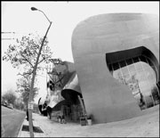
2. EXPERIENCE MUSIC PROJECT, SEATTLE CENTER: Paul Allen’s rock-music museum is architectural megastar Frank Gehry’s first Northwest project—and the most significant aesthetic by-product of the region’s high-tech wealth. While not the Bilbao Guggenheim Museum, this wildly inventive design is still a major addition to the city. It would have been even better if Allen had allowed Gehry to design more of the interior.
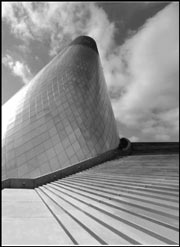
3. ST. IGNATIUS CHAPEL, SEATTLE UNIVERSITY: This small, expensive, complicated structure by Washingtonian-turned-New Yorker Steven Holl reflects the influences of other architects and has its awkward moments— yet it attains a convincing wholeness and spirituality through artist collaborations and deft use of subtle color and natural and artificial light.
4. FRYE ART MUSEUM, FIRST HILL: On a modest budget, Olson-Sundberg remodeled and expanded an older building to produce a series of fine, problem-free spaces for showing art that is also a handsome street presence. This subtle, highly civilized building out-performs the local museum efforts of several big-name East Coast firms.
5. TWO UNION SQUARE, DOWNTOWN: Seattle’s postwar skyline tends to emphasize sheer height over imagination or design refinement, but NBBJ’s design rises above mediocrity to combine all three in a sleek, modern package (see photo at right). Elegant and rational, this is the city’s best skyscraper since the predepression Northern Life Tower.
6. PHYSICS & ASTRONOMY BUILDING, UW: Cesar Pelli convinced UW to create a new green space framed by two buildings. The result is a dignified brick-and-copper ensemble that subtly blends retro and contemporary styles, and respects older campus buildings by emulating their principles rather than their styles. Who says this isn’t rocket science?
7. METRO BUS TUNNEL, DOWNTOWN: Parsons-Brinckerhoff’s engineering, TRA’s design, and 35 integrated public art works bring a big-city flavor to medium-sized Seattle. The five stations, each designed differently, are unified by a richness of materials, attention to detail, and grandness of scale. Its main flaw is that it shuts down at 7 p.m.
8. FREEWAY PARK, DOWNTOWN/FIRST HILL: Lawrence Halprin’s and Angela Danadjieva’s boldly sculpted and landscaped lid over I-5 joins two districts physically, although less so socially as there is a perception of danger there— especially after dark. Better management (perhaps by an entity other than the Parks Department) would help.
9. WASHINGTON MUTUAL TOWER, DOWNTOWN: New York firm Kohn Pederson Fox produced a postmodern design that evokes classic big-city prewar skyscrapers (albeit in a simplified fashion), and gives traditionalists something to look up to.
10. BANNER BUILDING, BELLTOWN: Paradoxically, Belltown is a hip neighborhood inundated by banal new condo and apartment construction. Ed Weinstein’s Banner Building breaks that mold—providing upscale, vertically stacked, double-height artists’ loft residences, as well as more conventional flats. Materials are semi-industrial to recall the waterfront and the vanishing blue-collar community.
11. DENICE HUNT TOWNHOUSES, GREENWOOD: Conscientiously designed on a shoestring by Tonkin-Hoyne-Lokan, this low-income housing cluster creates a lively streetscape and nicely scaled courtyard. Few of the city’s newer market-rate apartments and condos are as evocative of shared domesticity, or as supportive of their neighborhood settings.
12. REI, SOUTH LAKE UNION: The funky urban-rustic architecture of this outdoor-goods retail building is a tribute to Seattle’s Gore-Tex and plaid flannel subculture, which is purveyed within. Mithun Partners created some nice spaces inside, too—culminating in a rock-climbing structure within the corner tower.
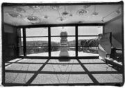
13. GEORGE SUYAMA STUDIO AND GALLERY, BELLTOWN: This elegant, minimum-intervention refurbishing of an old commercial building combines an architect’s studio, retail space, and a noncommercial experimental art installation space provided by the architect.
14. HOLLY PARK REDEVELOPMENT, SOUTH END: No big new ideas here, but Weinstein-Copeland’s replacement of a diffuse suburban cul-de-sac plan and barracks-like buildings with a compact urban street grid, nicer building forms, and mixed-income tenancy is all for the better. The loss of some low-income units, however, is regrettable.
15. LARRY’S MARKET, NORTH SEATTLE: Markets are usually as visually interesting as instant oatmeal, but in a series of buildings for Larry’s Markets—located in Seattle and on the Eastside—Don Carlson shows that vernacular forms, industrial materials, and natural lighting can be used to make cool, unpretentious spaces. This design informality has become Larry’s trademark, and has been emulated by other local buildings.
16. SAFECO FIELD, SODO: When voters said no, the Mariners bullied politicians to build it anyway. It’s too far from Pioneer Square, its rolling roof isn’t needed, it went way over budget, its timid brick veneer contradicts its powerful steel structure, and it’s cold much of the time. Still, NBBJ’s ballpark has restored outdoor baseball to Seattle (when the roof’s open), and lets us claim the most expensive stadium in the U.S. Unlike Randy, Junior, and A-Rod, it will never leave town.
