THE FIRST EXHIBITIONS to be mounted in the new Bellevue Art Museum building have a different significance than the ones that will follow. These must prove the mettle of the space, prove that the museum is ready to emerge from the mall (it’s only crept across the street, but just the same . . .) and stand as a “real” museum. They must also showcase the space as much as the space has been designed to showcase them, embodying the museum’s mission and signaling its programmatic aspirations. This makes tricky business of curating these inaugural exhibitions; the pressure’s on. And the fact is, with its odd-shaped walls and unwieldy layout, the space is a drastic break from the traditional gallery.
Luminous: Light as Material, Medium, and Metaphor
Bellevue Art Museum January 13- 17
Juan Alonso: Give/Take
Bellevue Art Museum January 13- April 8
BAM reopens with “Luminous: Light as Material, Medium, and Metaphor,” an exhibition focusing on artists’ use of light. Works by Iole Alessandrini, Dan Flavin, Bonnie Porter, Mark Tobey, Bill Viola, Dan Webb, and others are intended to reflect the centrality of light in the building’s design. Adjacent to this are Seattle-based painter Juan Alonso’s highly textural, symbolist paintings, executed in extra-large format to accommodate the scale of the space. In what is called the Explore Gallery, visitors can build architectural models, watch films, and fiddle with an interactive computer program.
While elevating “experience,” “process,” “engagement,” and “hands-on activities” to the high ground once inhabited by art pieces themselves, BAM’s new mantras “See, Explore, Make Art” and “People Rather than Objects” relegate artwork to a secondary position. The idea is to make accessible aspects of art that have traditionally remained invisible, to reveal the little man behind the curtain and dispel the magic. To this end, the museum puts artwork on the back burner.
Of course, that’s a pessimistic stance. Both physically and conceptually, the new building seemingly makes an ideal breeding ground for dynamic projects. The gallery spaces, rather than at the core of the building, are located at the top—a metaphor for loftiness come to life. The current exhibitions also happen to be ambitious. “Luminous,” though esoteric and conceptually dense, is provocative, dipping into the realm of new media (albeit not as far as I expected, knowing that the building is wired with the state-of-the-art technology you’d expect from a museum at the epicenter of innovation). Alonso’s paintings, by contrast, hang like artifacts from a former time. They are beautiful objects in the most traditional sense, reminding us of the function of the conventional gallery.
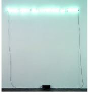
For “Luminous,” curator Brian Wallace makes several choices that prove stunning, particularly in the context of the history of Northwest art. Building on Mark Tobey’s “white writing” (light squiggles on dark backgrounds) paintings—two of which are in the show—he advances a brilliant thread of comparisons that is more about white writing (light squiggles on dark backgrounds) than about the exhibition theme of light. He juxtaposes Tobey’s work with Tokihiro Sato’s photographs, images bursting with the energy of a white writing all their own. Sato “draws with light” by opening the shutter for an extended period and creating thousands of delicate, dancing streaks that flame up and down the curving central stair. A more literal connection is made between Tobey’s white writing and Joseph Kosuth’s No Number #1, a sentence written in soft white neon: “Visual space has essentially no owner.” Sato’s photographs represent a direct reaction to the architectural space, while Tobey’s works tie the newer works to the roots of regional art, underscoring BAM’s commitment to local artists. Using this highly commercial media, Kosuth in turn questions the ownership of space and the role of the museum as public forum.
ARCHITECT STEPHEN HOLL led a throng of reporters and me through his building recently. It was fascinating to see the structure unfold before his eyes. For he, like the rest of us, was seeing it for the first time in this state of near-completion. A particularly revealing incident occurred when he stepped onto the third floor’s central terrace, the Court of Light, and gawked in astonishment at the work of art installed there. Here was the designer in awkward confrontation with the very purpose for his creation. His building, meant to house works of art, seemed strange to him with part of an exhibition cluttering its lines. He regained his composure and continued the tour. But James Carl’s Fountain—made of nine beverage vending machines arranged serially so that the blown-up, illuminated images on their glossy facades create a panoramic photograph of Niagara Falls—gained stature during that moment of shocked silence. This spectacle of nature pared down or “canned” befits the paradox of the terrace perfectly: It melds artifice and nature, commercialized products and natural resources, in very much the same way that Holl’s building stands as glitzy packaging for the slippery element that is art.
