For more than a decade, Seattle illustrator Ed Fotheringham‘s retro, blotty-lined artwork has appeared in The New Yorker, The New York Times, and other publications (including
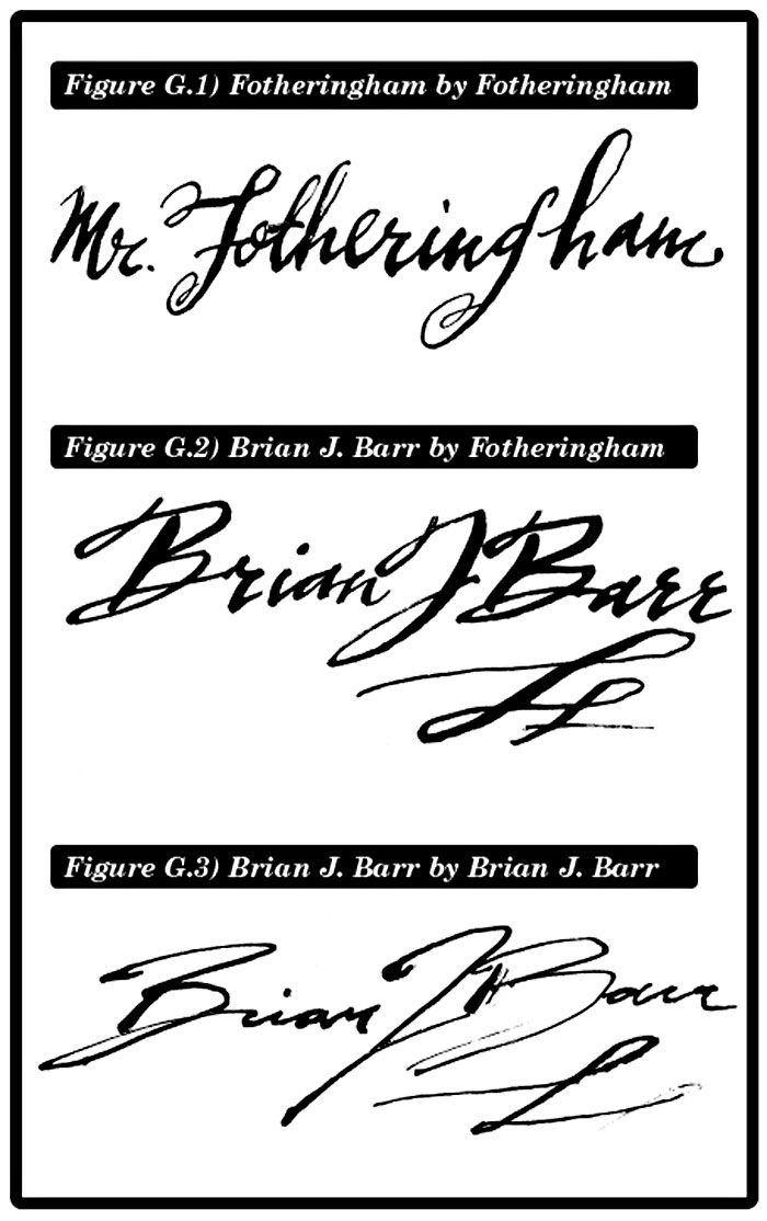
this one). And always his signature—all curly, fancy letters—spells out “Mr. Fotheringham,” suggesting that the man behind it must be some sort of high-class chap fancying pince-nez, designer scarves, and cigarettes from a tin case.
“It just seemed so bizarrely sophisticated,” he says of the distinctive professional stamp he developed. “It was absurd!”
Fotheringham works in a cluttered fourth-floor studio at the School of Visual Concepts. It’s the same room he’s rented since the late ’90s. Tacked to the walls and scattered about his shelves are various pieces he’s done over the years, including an old Bumbershoot poster and a cover for a Rhino Records Ennio Morricone collection.
He’s also done ads for clients like Neiman Marcus and Visa. But the works Seattleites—or maybe just music geeks—will recognize best are his album-cover illustrations for Mudhoney records such as March to Fuzz and the band’s latest, The Lucky Ones. Fotheringham’s career is inextricably linked to Mudhoney: He’s known the band members since the early ’80s when he moved from Australia to study painting at the UW. He lived in a Westlake house with bandmates Steve Turner and Dan Peters, and even sang in the Thrown Ups with Turner.
By the ’90s, Fotheringham was obsessed with the early work of Andy Warhol— effeminate, delicate illustrations for catalogs and advertisements in a blotty-ink outline technique that Warhol had invented. For Mudhoney’s Piece of Cake, the band’s first record for Warner Bros., he employed this technique for the jacket illustration of two men pissing on the fanciest slice of urinal cake ever.
It was on that record cover that Fotheringham first deployed the pretentious little glyph that has become his signature flourish. Once again, it was derivative of Warhol, whose lettering was inspired by his mother. “She was a Polish immigrant,” says Fotheringham. “And her handwriting was really wild. It never stayed on the same line.”
“Thin on the upstroke…and push hard on the downstroke.” It sounds filthy, but Fotheringham is demonstrating with a dip-pen and ink how he signs all his illustrations—including a series of collaborations with children’s book authors for Scholastic Press. (The next will be a book about Australian Olympic swimmer Annette Kellerman. Fotheringham is also working on a new ad campaign for Top Pot Doughnuts, set to appear next month.)
He hands me the pen and lets me take a stab at a signature. Normally, my signature bears no resemblance to my name, so I’m a little stiff with the pen. “It takes practice,” he says, showing me a little calligraphic ribbon I can make over and over again that will make me more comfortable with this archaic instrument. I try pressing down for thick lines and swinging up lightly for thin ones. I spatter only a little ink, but it’s still not as cool-looking as his.
It’s also taking me forever to sign my name. How does he manage in such a deadline-oriented craft?
“Oh, it’s on the computer now,” he says. “It’s a Vector file.”
He sets the Old World technology aside for a moment and shows me how, these days, if he wants to sign his name, all he has to do is click, drag, and drop. Sophisticated, indeed. And if Warhol were alive, he’d no doubt do the same.
