Why is it that in some restaurants you want to eat everything they sell, and in others you can’t find a single dish to order?
It’s the menu, stupid. Too small, too long, too confused, too descriptive, not descriptive enough—these are but a few of the sins that can get between a hungry patron and her own little piece of dining nirvana. Goodness knows this restaurant critic has, on more than one occasion, been so blocked.
So restaurant owners, take heed: Here is one diner’s list of what not to do on your menu, humbly offered with the help of a team of sage Seattle consultants and chefs.
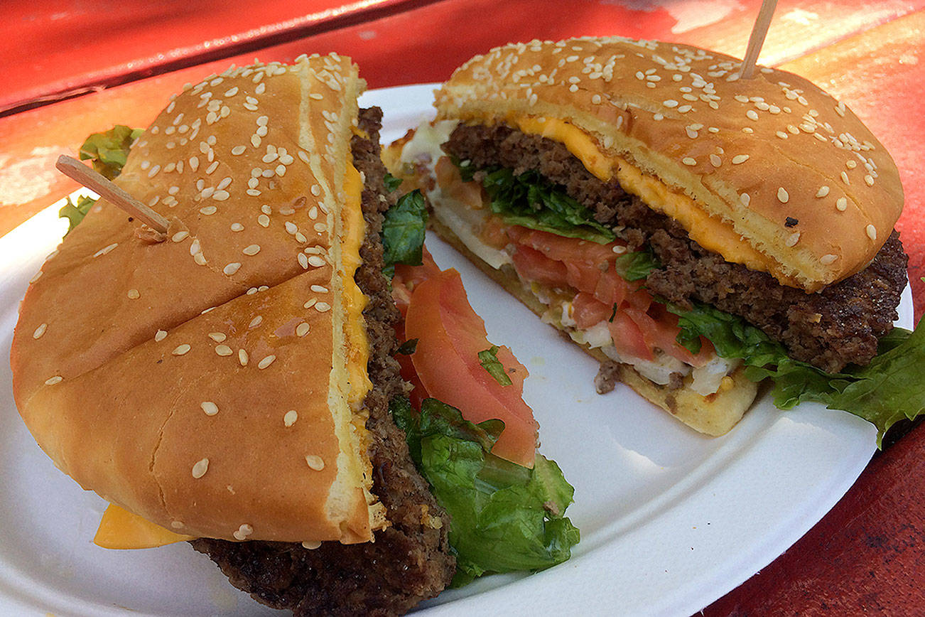
Don’t call a hamburger a “hamburger.”
Better to call it a “quarter-pound of mesquite-grilled Idaho beef, smothered with grilled onions.” “Use tantalizing words,” advises Sharon Kramis, the longtime local foodie and menu consultant who currently works with Anthony’s HomePort restaurants. The Brie might be “creamy Brie”; the bread “crusty French bread.”
Canny restaurateurs know this as smart sales: Precise descriptors (“smoky,” “buttery,” “garlicky”) make the saliva flow, just as certain words play up the atmospheric benefits of eating out. “I like to mention the romance part, like anything done in a wood-burning oven,” offers Tom Douglas, chef/owner of the Dahlia Lounge, Etta’s Seafood Grill, and the Palace Kitchen.
Sales aside, the diner can be vastly aided in her choices by descriptive precision on the menu. A “tart vinaigrette” is not just any vinaigrette; a “flourless chocolate cake” occupies an entirely different genus of dessert than chocolate cake. “I love the word ‘savory,'” muses Douglas. “Food has gotten so confused. If you say you have lavender in something, like a lavender vinaigrette on quail, people might immediately think, ‘lavender, dessert spice, sweet.’ I’ll use ‘savory’ for that.”
Don’t describe to death.
Too many words kill the romance. Here is the description of a dish I recently encountered in a Seattle restaurant: “Sweet peppers, garlic, Dungeness, and rock crab cakes lightly saut饤 and served over a sweet and sour beurre blanc partnered with a fresh pear, j�ma, and mint slaw briskly tossed in a fresh ginger and passion fruit vinaigrette.”
Aside from the fact that any dish described in that much detail would sound awful, there’s something almost pornographically literal about it. “I like to preserve an element of surprise by listing just the main components of a dish,” says Tamara Murphy, the former Campagne chef who just opened her own Mediterranean place, Brasa, in Belltown.
According to Banger Smith, president of the Seattle consulting firm Menus for Profit, Murphy’s right in fashion. “It’s very cool now to offer less description,” Smith says. “You can’t take that too far—if you don’t want to sell something, write no copy at all. But in general, the more succinct you are, the more you’ll sell.” Smith will even take out words like “with” and “and” in his efforts to streamline description.
Don’t neglect variety.
Small neighborhood restaurants are among the most appealing this city has to offer. They also tend to offer the least variety. Last year I reviewed an otherwise sensational Italian place that was nearly all pasta, almost all of that vegetarian, and the few exceptions used cured meats. Small places driven by the tastes and idiosyncrasies of their owners, however charming, often appear to forget that other tastes exist. Let this be a reminder.
Contrary to prevailing opinion, size doesn’t matter. Short menus are actually something of a relief (see below)—as long as they offer choices of significant difference. Seasoned restaurateurs and consultants admit to obsessing about these choices—about meeting demographic demand for both male food (steaks) and female food (salads, chicken)—but have to stay within reasonable cost parameters. So they’ve developed methods of creating the illusion of variety. Consultant Smith attests that when a restaurant divides up menu offerings under headings—Salads, Chicken, Specials, From the Grill, and so on—diners will perceive more variety than if the same items were undivided.
Avoid “delicious,” “fresh,” and “perfect.”
By all means be delicious, fresh, and perfect—just don’t go promising it on the menu. A quick browse through my personal menu collection reveals the following superlatives: “seasoned to perfection,” “chargrilled to perfection!”, “a study in perfection,” “incredibly delicious,” “incredible beef,” “a perfect baked potato,” and “you won’t find a better meal on the planet.”
Perhaps I’m the one devilish diner on the planet who is rendered cynical by such promises, but I doubt it. (All I could think about when dining on that last guarantee was how surpassingly wrong it was.) Such superlatives aren’t description, they’re advertising—and therefore utterly useless to the diner trying to choose a meal. I’ll take one “smoky” or even “herby” over a dozen claims of “delicious.”
As for “fresh”—wouldn’t we like to think we could take that one on faith? “We’re trying to eliminate the word ‘fresh’ from our menu,” says Douglas. “It’s used too often, and it’s like . . . you know, duh. . . . If it’s not fresh, you shouldn’t be in business.”
Don’t go being all healthy.
“Here’s the thing,” Smith admits. “People talk healthy, but they eat tasty.” A menu liberally speckled with little heart-healthy icons is heartily embraced by focus groups—as good for the other guy. “If you want to sell less of an item,” Smith says, “put a heart on it.” Generally, people eating out are in a splurge mindset and don’t want to be reminded of their diet.
Eschew obfuscation.
Or don’t assume your diner knows what rapini and teleggio are. Restaurateurs and consultants agree: There’s nothing more insulting to a diner than making him drop $100 on a meal only to embarrass him in front of his date by forcing him to seek translation. Still, plenty of high-end menus persist in including one or two arcane exotics requiring explanation.
The reason? Perhaps chefs get so immersed in their culinary universe that they simply lose sight of what’s occupational jargon. Another explanation would hold that provoking server-diner interaction by any means possible is good for sales. But most likely, offers menu consultant Smith, high-falutin’ words communicate cachet. So, goes conventional wisdom, do branded and specialty foods—Sally Jackson cheese, Meyer lemons—even for diners who have no idea what such designations mean.
The upshot? Menus will always tell the story of their restaurants. A place whose menu uses puns or describes dishes as “gooey” is not the sort of place to offer rapini and teleggio.
Don’t be huge.
It’s the Chinese restaurant syndrome: page after paralysis-inducing page of choices. Choice being inherently stressful, restaurants do well by their patrons when they pare menus to the fewest number of choices within the widest possible variety. According to Smith, restaurants generally do 80 percent of their business off 50 percent of their menu anyway. Most could stand to prune.
And while we’re on the subject of huge—an astonishing number of places could shrink the surface area of their menus by half and still end up with pages rivaling the Sinai scrolls. I have no idea why menus have grown so physically hefty, but I for one would rather see my table covered with food than with words describing it.
Don’t say “fried,” don’t say “sauce”. . .
. . . if you want to suggest freshness and health, that is. “These words carry subliminal messages of fat and cholesterol, and when I’m reviewing menus I suggest various ways of getting around them,” says Debra Hermanson, a former restaurant manager (Ray’s Boathouse, Restaurants Unlimited) who is now associate dean of the Culinary Arts and Hospitality Management school at Seattle Central Community College. “One thing restaurants should never forget: A menu is a sales tool, meant to create guest perception.”
Menus, in other words, are designed to manipulate diners. According to Hermanson, savvy menu technicians can downplay guest perceptions of priciness by burying prices in small type within the copy, not highlighting them along the righthand column. Or they can emphasize certain dishes, as Hermanson did at Ray’s, when focus groups suggested that there weren’t enough non-seafood items on the menu. “Because of our cost goal, we couldn’t add more beef or meat dishes,” she says. “But we could use the menu to emphasize them graphically, in boxes or shaded areas, sending the perception of increased variety.”
There is, as it turns out, a shockingly precise science to all of this. Menu consultant Smith can tell with a fair amount of accuracy which direction a diner’s eye is likely to move while scanning a given menu. Smart restaurants, for instance, will list their highest-profit items as the first and last under a given heading, knowing that those are consistently the first and second most-frequently ordered.
Don’t be unreadable.
Sounds obvious, no? Not hardly. A stroll through my menu collection reveals more than a few with teeny-weeny type, elaborately illegible fonts, or graphics that get in the way of readability—practices that drive consultant and frequent diner Sharon Kramis crazy.
Not to mention spelling that gets in the way of readability, the particular bane of nerds like me. Call me picky, but a lucious cesar salad or chedder cheese on potato’s will make me nuts all the way through to dessert.
Jana Uyeda also contributed to this report.
